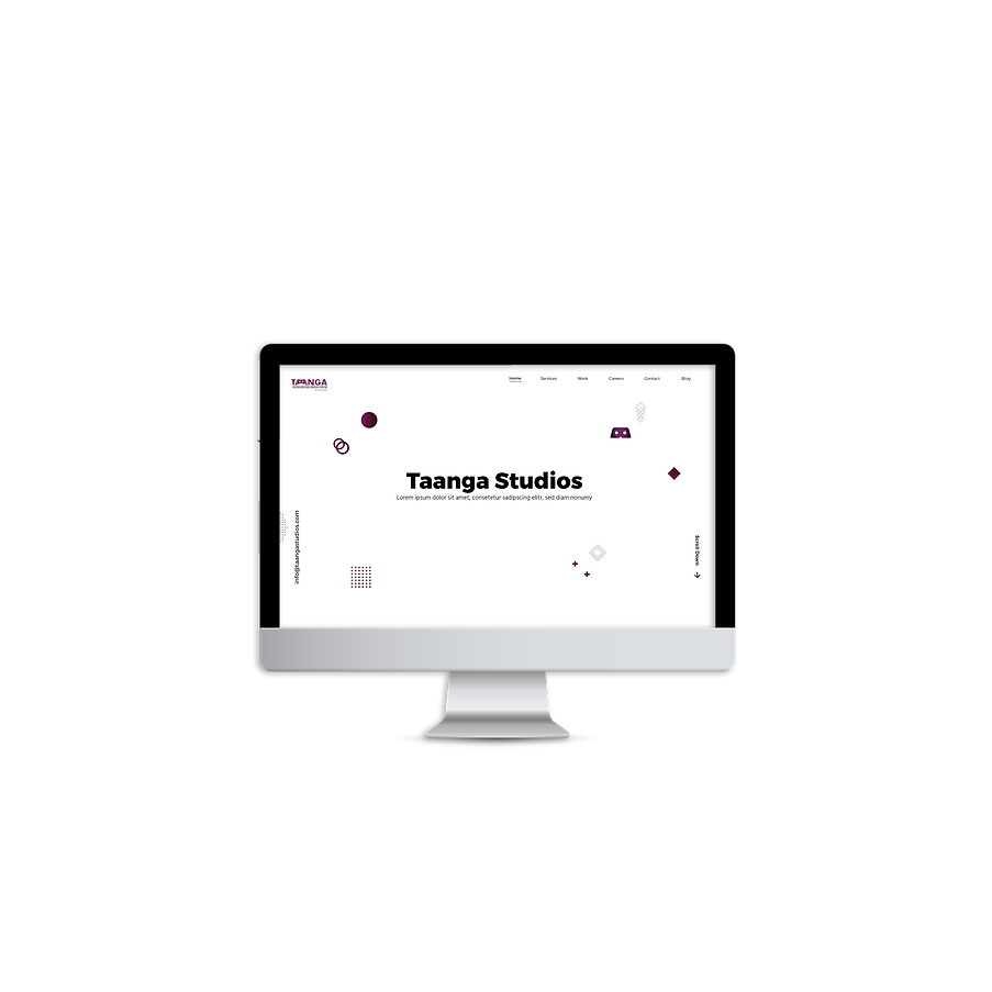
Taanga Studios
WEBSITE DESIGN
A simple and intuitive website aimed at quick information assimilation through easy user experience was designed to establish the online presence of Taanga Studios.
SUMMARY
The Challenge
Taanga Studios wanted an online presence comparable to that of international competitors as they were looking to reach out to a global audience. The company wanted a straightforward and minimalistic platform - easy to navigate, information available upfront- held together by a design style that was classic.
Scope
Web Design,
Illustration
Role
Graphic Designer, UI/UX Designer
Duration
2 months
Tools
Adobe XD,
Adobe Photoshop, Adobe Illustrator
The audio used in the video clip is from www.bensound.com. Full credits attributed to the same.
PROCESS
Design Thinking
The 'Design Thinking' framework was my go-to approach.
Stage 1: Empathise
I sat down with the stakeholders of the company to gauge their needs, plans and expectations for the website. They wanted an online presence comparable to that of international competitors as they were looking to reach out to a global audience. The company wanted a straightforward platform - easy to navigate, information available upfront and held together by a design style that was classic.
Stage 2: Define
With the information gathered, I could define the task facing me. The problem statement was 'Build a website for Taanga Studios to showcase their services and projects to an international audience and use a minimalistic design style.
Stage 3: Ideation
The product owner communicated the pages he wanted me to design. Together, we developed various navigation flows and shortlisted the one that simplified the user's experience for quick assimilation of information. Once the UX process was in place, I researched competitor brands, looked at several design styles and mood-boarded my finds to set the tone for online visual identity of Taanga Studios.
Early Sketches
Sitemap


Stage 4: Prototype
I decided on a minimalistic design style, in tune with the brand colours, shapes and typefaces. An addition to this were illustrations to areas where images would be imposing and repetitive. The illustrations were all developed by myself.


Stage 5: Testing
I decided on a minimalistic design style, in tune with the brand colours, shapes and typefaces. An addition to this were illustrations to areas where images would be imposing and repetitive. The illustrations were all developed by myself.

